Thomson Rogers
Client: Thomson Rogers
Agency: Zync Communication Inc ( Believeco)
Scope: Brand Audit, Brand Strategy, Market Positioning, Brand Creative, Brand Guidelines, Business Collateral, Website, Digital Marketing Campaign, Radio Commercials, Videos, Social Media Marketing, SEO/SEM, and Signage.
Role: Rebrand, Print & Digital Assets, Website, Brand guidelines, and Image Selection.
Thomson Rogers is one of Canada’s largest litigation firms. They’re leaders in personal injury law, family law, civil, municipal and land use litigation.
As part the team at Zync Communications Inc, my role to assist in all areas of the rebrand and take on responsibility for individual projects. The challenge of the rebrand was take our strategy and communicate it visually in all areas of our design scope. The strategy was to display “clients” returning to their life after an serious injury or legally situation and getting back to enjoying the little moments. To learn how I tackled this challenge, please scroll down the case study.


Image Selection
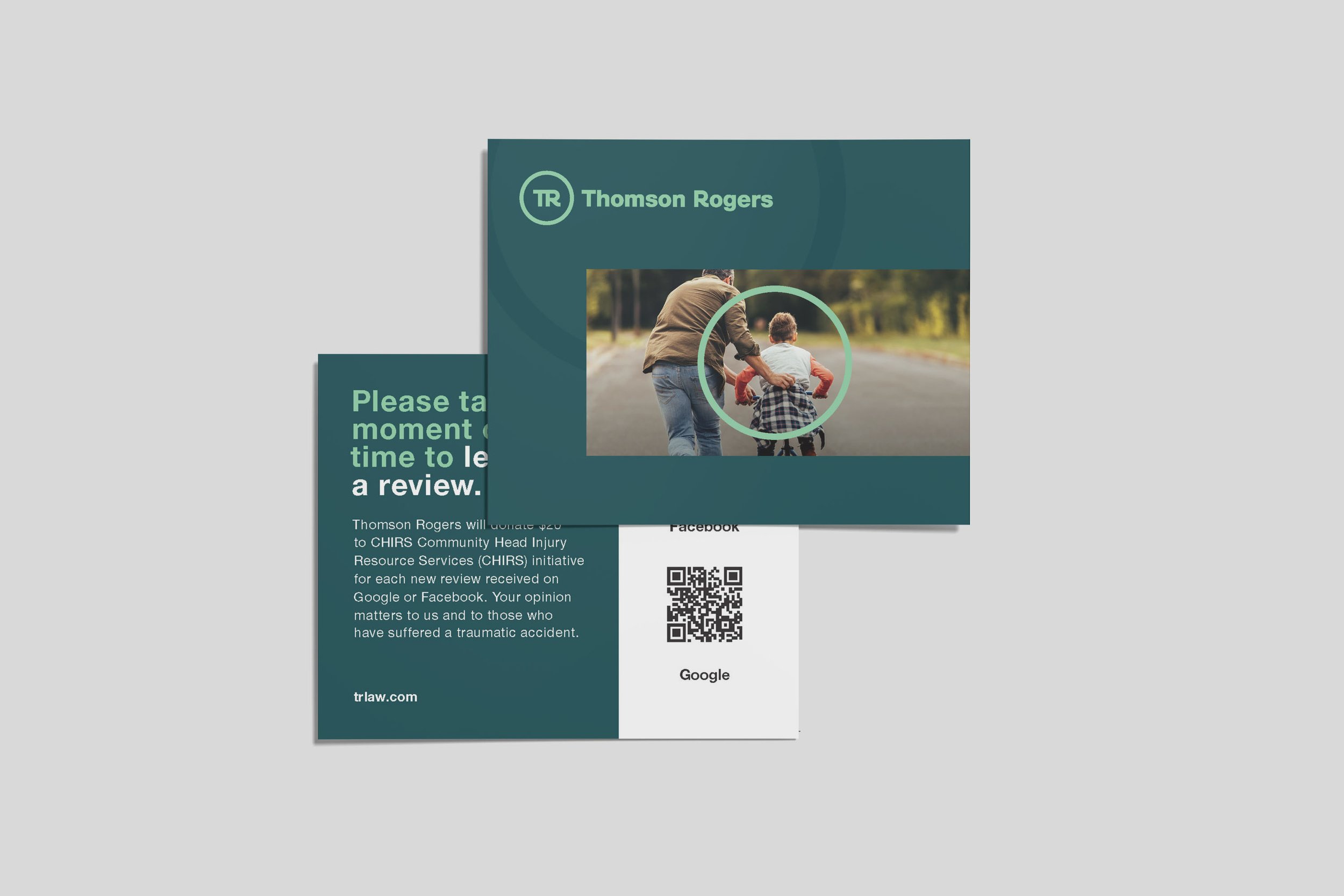
Image selection was very important, and key to conveying the brand strategy across all channels. In my search, I focused heavily on subject matter – finding scenarios showing life’s touching moments and often showing a disability. These images were meant to give clients reassurance that they will return to the joys of life regardless of whether they now have a serious injury or disability. When searching for specific practice areas, I took a different approach, and I chose images that represented that the area of law, but were more abstract and less jarring.


Traditional
Thomson Rogers is a well-established in the law community. In order to retain brand equity, the traditional logo was keep and a digital friendly logo was created. The brand recognition is maintain through the TR icon. The traditional logo is used for print pieces, and signage.


Digital
The TR law logo and icon was created to be more digital friendly. It allowed for for more flexibility with the website and social media design.

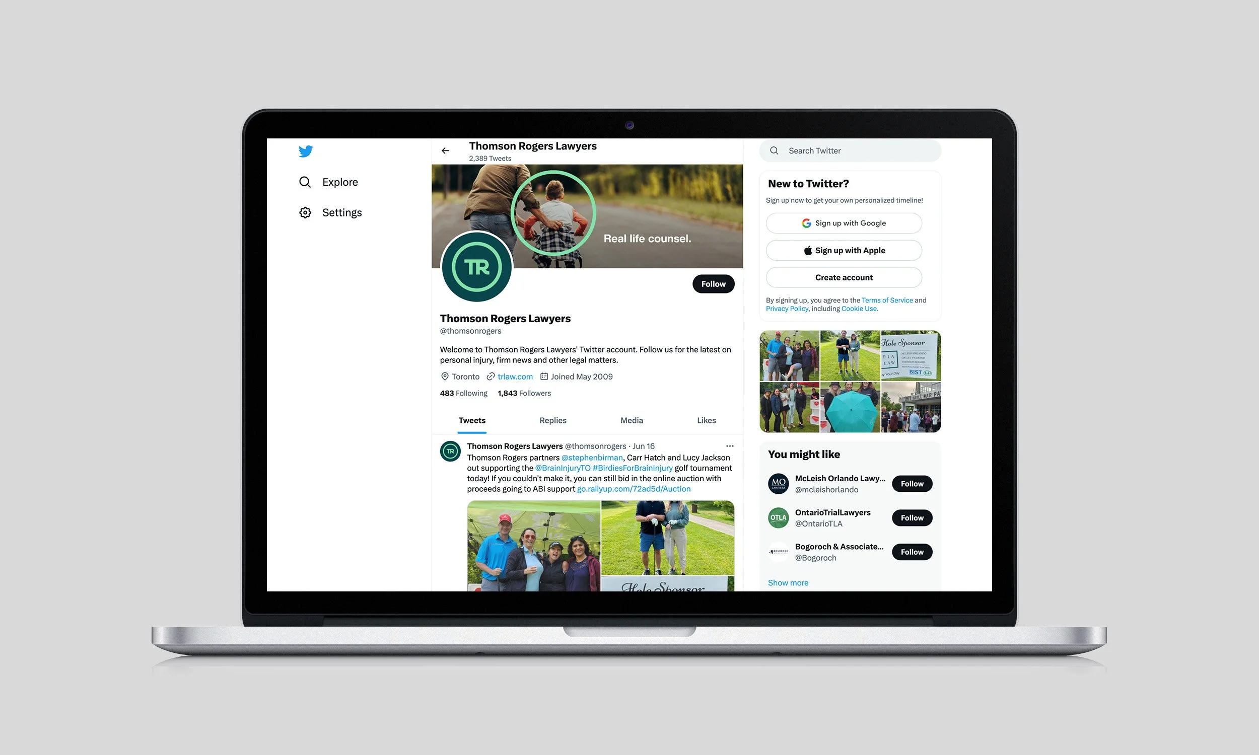
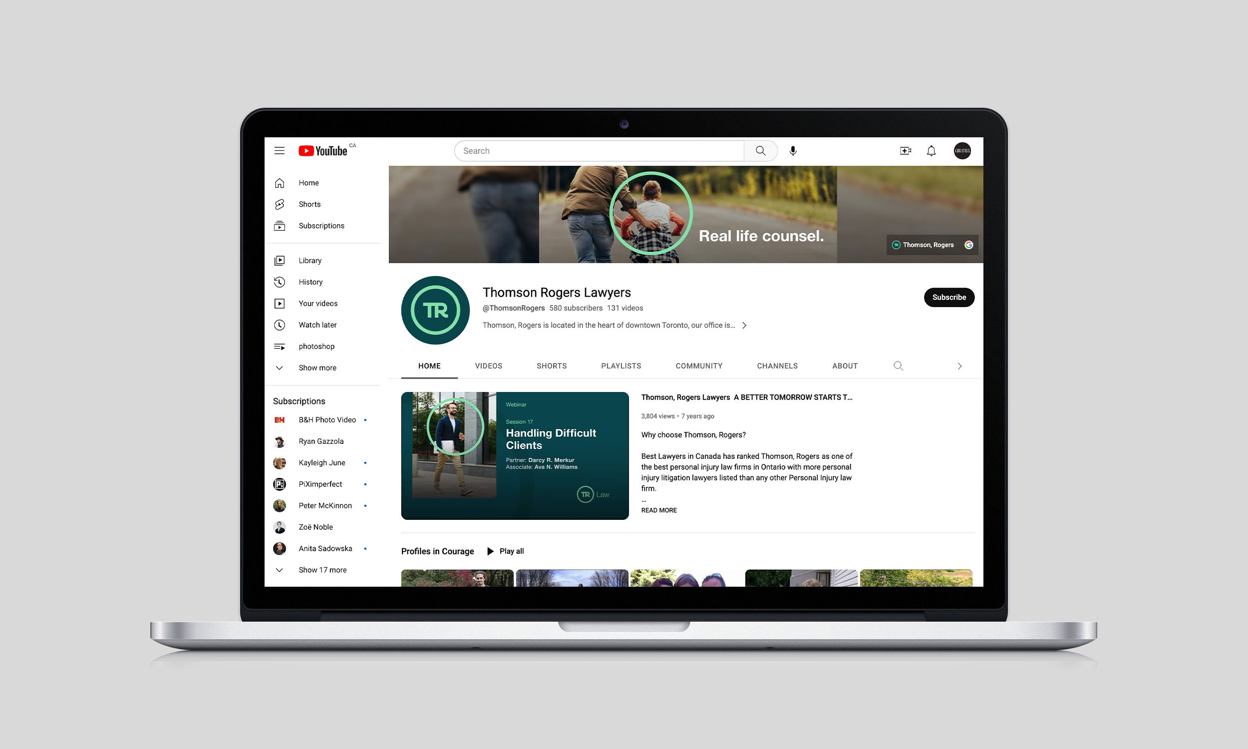
The banner is suppose to symbolize the brand strategy and visually represent a client’s hope for a positive future with TR’s help. Thus, I focused on creating a visual based on every-days moments in life that a client would want to regain. The circle visually incapsulates or focuses on the moment while the tagline below represents TR’s support. These banners were completed for Twitter, Linkedin, Facebook, and Youtube.
Banners


The goal of the post was to create a signature look and grid system that I used across all digital TR collateral. By incorporating the circle, it allowed me to tie other parts of the collateral together and created consistent digital presence. The design was adjusted for Facebook, Twitter and Linkedin.
Posts


Youtube
TR law has a variety of webnair series and video series. I create video titles to keep the brand consistent across all channels.


Website
Zync Communications Inc. worked with an outside party to create the new TR website. The goal was to modernize, organize, and keep it cohesive with the rest of branding.
Email Template
An email template was created to be used by TR staff. I created a minimalistic design that was and easy to use. Press play and you can see the fill design
