Avvy
Client: Avvy
Agency: Zync Communication Inc ( Believeco)
Scope: Brand strategy, Naming, Visual Identity, Collateral, Website design, app UX/UI.
Role: Digital Assets (Icon Design) and Case Study.
Avvy is a healthcare app that collaborates with companies to provide easy and convenient access to health-care services.
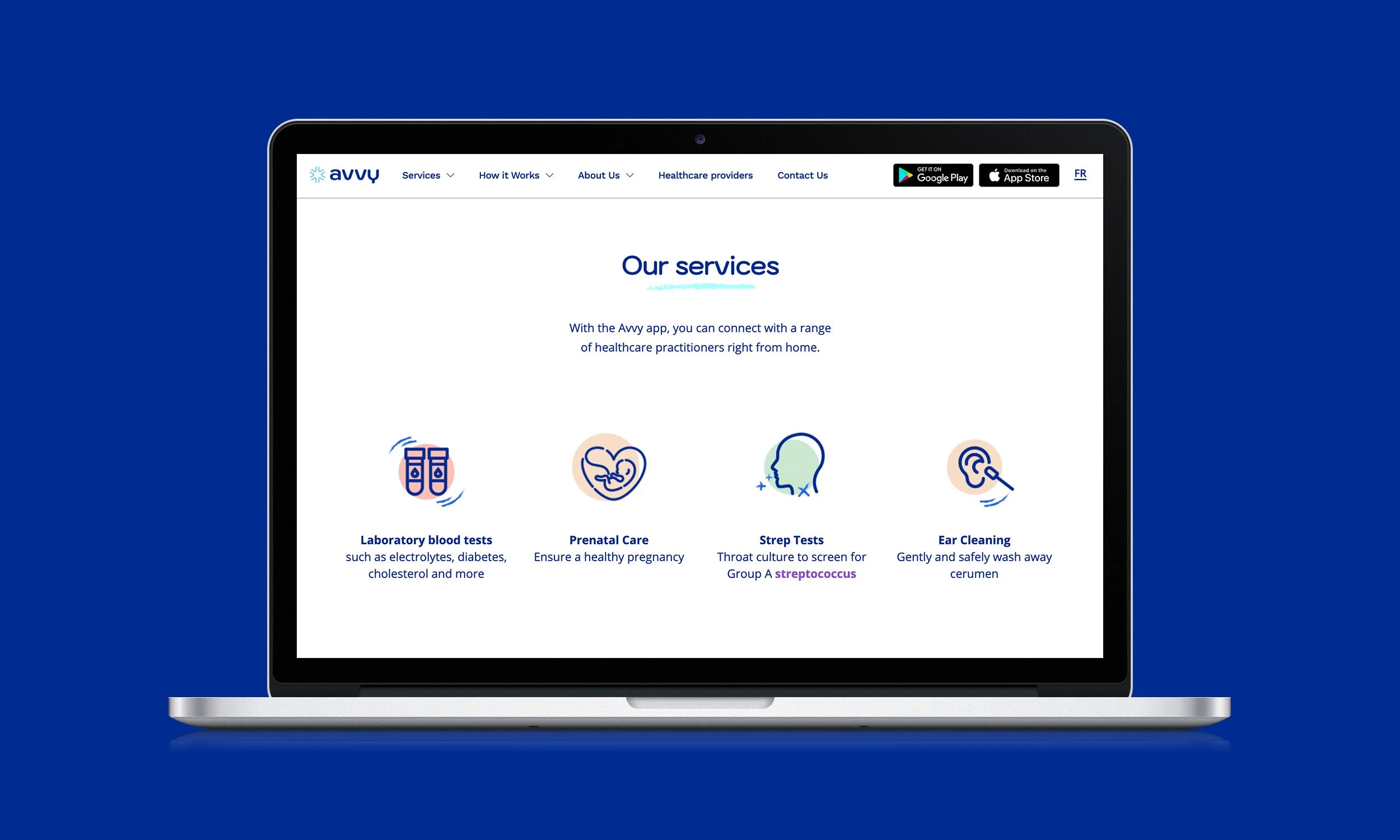
As part the team at Zync Communications Inc, my role was to create icons for the app that represented the health-care services Avvy provided. The challenge was to create icons that were straight forward –conveying the meaning of service while also fitting the aesthetic of the brand. To learn how I tackled this challenge, please scroll down the case study.


The icons were designed to represent the service and be distinguishable without a label. To ensure the distinguishability, I used well-known symbols, but in a creative way that conforms to Avvy’s unique brand identity. For example, the EKG icon includes two symbols that are commonly associated with the diagnostic test: heart, and wavelength. However, the heart is illustrated in the hand-drawn like font to give it Avvy’s signature look.
Icons

App
The Avvy app is “the first mobile digital platform bringing healthcare to Canadians when they want it, where they want it – all with just a few clicks.” The goal was built to be a user-friendly app and to be navigated with ease. The design achieved this by prioritizing minimalism, whitespace, and overall keeping the main focus on the service provided.


Website
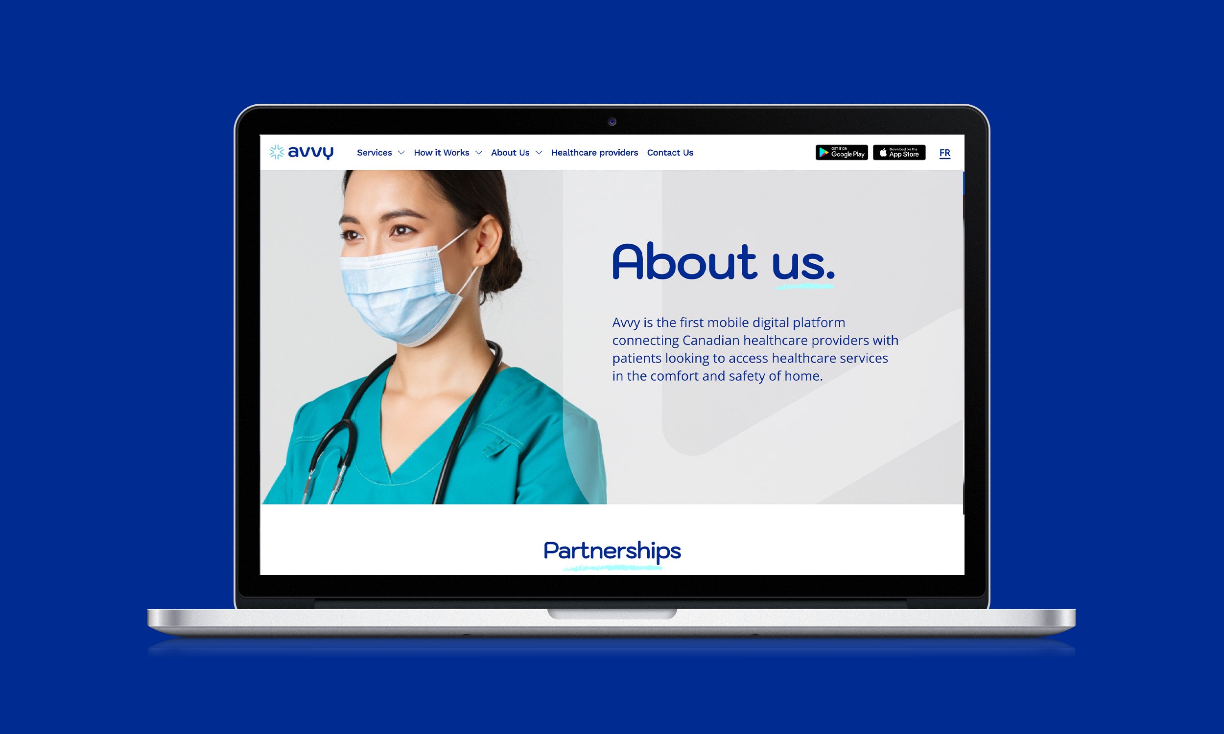
The website brings elements from the brand guidelines and app to create a consistent experience across all channels. It was to important to go back to brand message behind the tagline “we will be right there”, and making the information and service easily accessible.


